a catalyst for placemaking
Downtown Oklahoma City
Industry: Association, District
Services: Brand Positioning, Logo Design
Downtown Oklahoma City Inc. is the voice of Oklahoma City’s Downtown district and its merchants. It is the only organization solely devoted to downtown and is focused on the “big picture” elements required to attract world-class development and create a true 24/7, vibrant downtown. Through its many roles as a leader, convener, facilitator, idea-generator, recruiter, manager and policy advocate, Downtown OKC has a direct influence on downtown users and future development. Downtown OKC’s top three priorities are aggressively promoting the urban lifestyle, efficiently managing the business improvement district and collaborating with downtown stakeholders on key issues impacting downtown. These serve as the basic, integrated elements of the organization.
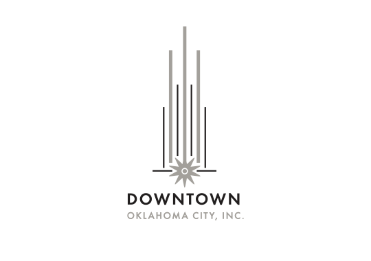
The brand emphasizes the company’s focus on downtown and downtown alone; separate and distinct from other districts or city organizations. We searched for deeper symbolism uniting DOKC with the city core, as a contemporary representation of the city and its roots.
This mark is a geometric and modern abstraction of a building/cityscape. The orientation is vertical, implying both the scale of the area as well as upward growth. The lines themselves are an indication of power bars, amping up the sights and sounds of the city just as the organization does for the area and its stakeholders. The spur in the center of the mark is symbolic of jolting progression. Less literally, it is a burst of energy itself, and a representation of the westward sun the pioneers followed as they staked out land in this exact location. This is the same entrepreneurial spirit found within the organization and the people it serves.
Downtown Oklahoma City Inc.’s mark is a little love note to downtown Oklahoma City and all of the things we love about it.